BEAUTY BRANDING
The X Mojo
Creating a sub-brand before the parent brand exists.
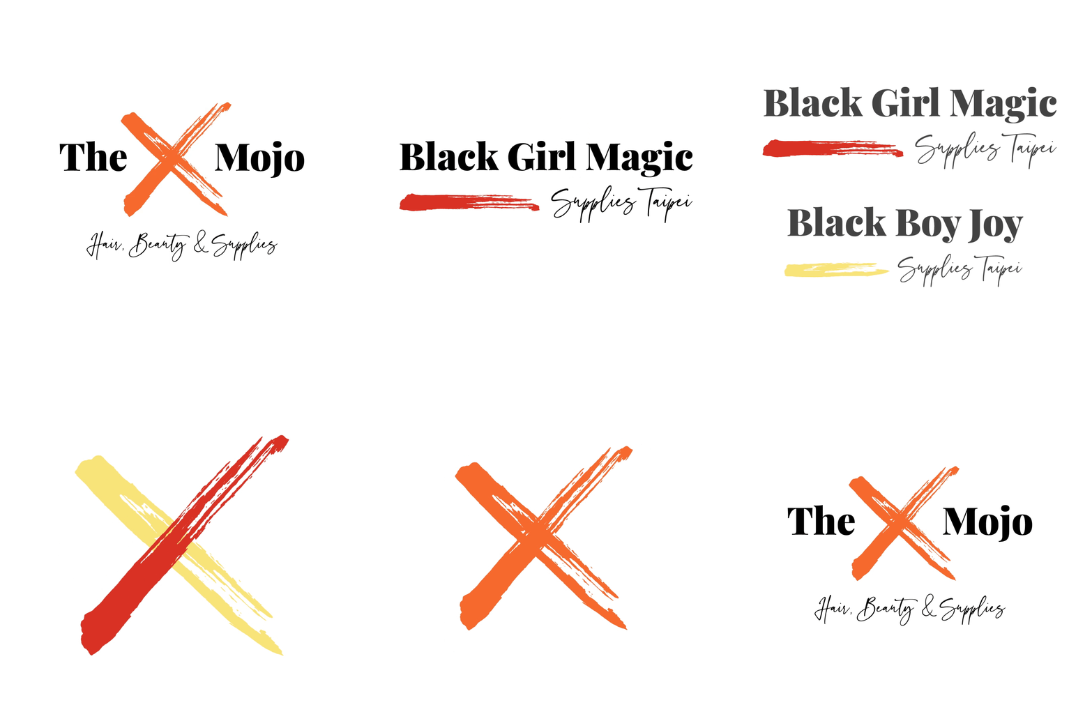
The X Mojo is a platform created by Monica Jordan, bringing curly hair care and beauty supplies to Asia. The interesting part about this project was that at the time, the brand was called Black Girl Magic. Monica was worried that this excluded other genders, so wanted a rebrand that appealed to all of her customers and allowed room for the brand to grow.
Starting with a refresh for Black Girl Magic, the plan was to follow it with the launch of Black Boy Joy. Both of these sub-brands needed to work as stand alone identities, while coming together under the parent brand 'The X Mojo'. The design elements stem from the idea that every customer, their hair, skin and needs are personal, and unique to them. Not only are the brush strokes in the logos created by a hair-like substance, they are hand painted and completely unique. The brush strokes from Black Girl Magic and Black Boy Joy blend shapes and colours to create the 'X' in the The X Mojo. The main logo font is bold, curvaceous and confident, while the supporting handwritten words tie into Monica's personal 'Thank You' notes to customers. These three identities were rolled out to their social media, packaging, website and a newly opened physical store and salon in Taipei. Watch this space for Black Pride+ coming soon!
CLIENT
ROLE
Brand Identity
Logo Design
Packaging
Social Media
Website Design
YEAR
2021


